FREE! Click here to Join FunTrivia. Thousands of games, quizzes, and lots more!
Quiz about LP Album Covers  The Extinct Art

L.P. Album Covers - The Extinct Art Quiz


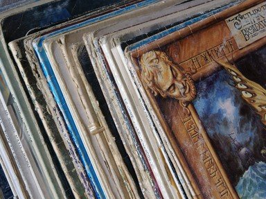
The birth of the CD was warmly embraced by music lovers worldwide. If only we knew it would lead to the death of album cover art. As Joni Mitchell once sang, "you don't know what you've got 'til it's gone."

A multiple-choice quiz by Aussiedrongo. Estimated time: 6 mins.
  1. Home
  2. »
  3. Quizzes
  4. »
  5. Music Trivia
  6. »
  7. Albums
  8. »
  9. Album Covers

Author
Aussiedrongo
Time
6 mins
Type
Multiple Choice
Quiz #
350,966
Updated
Dec 03 21
# Qns
10
Difficulty
Tough
Avg Score
6 / 10
Plays
1590
Awards
Editor's Choice
Last 3 plays: Guest 136 (10/10), Guest 98 (9/10), Guest 194 (9/10).
- -
Question 1 of 10
1. This 1966 studio album by The Beatles was their first to break with the tradition of simply having photographs of the band adorning the album cover. A collage of small photographic images were incorporated into and arranged around line drawings of each member of the Fab Four on which album cover? Hint


Question 2 of 10
2. Gimmicks are often used to boost sales of a product; sometimes they work, sometimes they don't. The latter was true for the 1967 self-titled 'The Velvet Underground & Nico' which failed to make any great impact despite featuring what novelty item on early pressings of its album cover? Hint


Question 3 of 10
3. Released in 1968, Big Brother and the Holding Company's 'Cheap Thrills' showcased the brilliant vocals of Janis Joplin. The comic strip styled album cover on the other hand showcased the artistic talent of which notable figure of the underground comic scene? Hint


Question 4 of 10
4. The graphic art team known as Hipgnosis created scores of album covers for some of the biggest, and not so big names in rock from the late sixties through to the early eighties. Their first design was the cover for 1968's 'A Saucerful of Secrets', the second album for which band? Hint


Question 5 of 10
5. Before providing the artwork for his own 'Self Portrait' (1970) and 'Planet Waves' (1974) album covers, Bob Dylan was also responsible for the painting that appeared on the cover of 'Music From Big Pink', the 1968 debut from which long time Dylan collaborators? Hint


Question 6 of 10
6. When Frank Zappa approached artist Neon Park to create the artwork for The Mothers of Invention's 1970 release 'Weasels Ripped My Flesh', the result was an amalgamation of a real cover from a magazine for men and a real advertisement for what type of gentlemanly product? Hint


Question 7 of 10
7. Money can be saved and artistic control can be kept in your own hands by creating the artwork yourself. Which folk rocker did just that for many of his own albums beginning with a drawing of a dented metal rubbish bin on the cover of 'Mona Bone Jakon' in 1970? Hint


Question 8 of 10
8. Really don't mind if you sit this one out, but in 1972 Jethro Tull released what frontman Ian Anderson described as "the mother of all concept albums", 'Thick as a Brick.' The original album cover was a mock-up of what type of reading material? Hint


Question 9 of 10
9. Many album covers have created controversy upon their initial release leading to them being edited for future pressings. Which 1974 David Bowie album suffered such a fate following objections to the half-man/half-beast painting of Bowie that appeared on its cover? Hint


Question 10 of 10
10. The KISS principle, that is Keep It Simple, Stupid, was adhered to for the cover photography for the 1975 debut album for Patti Smith 'Horses.' Who was it that shot this simple yet striking photo? Hint


(Optional) Create a Free FunTrivia ID to save the points you are about to earn:

arrow Select a User ID:
arrow Choose a Password:
arrow Your Email:


Most Recent Scores
Jan 13 2025 : Guest 136: 10/10
Dec 20 2024 : Guest 98: 9/10
Dec 01 2024 : Guest 194: 9/10
Dec 01 2024 : Guest 184: 9/10
Nov 27 2024 : Guest 104: 9/10
Nov 24 2024 : runaway_drive: 9/10

Score Distribution

quiz
Quiz Answer Key and Fun Facts
1. This 1966 studio album by The Beatles was their first to break with the tradition of simply having photographs of the band adorning the album cover. A collage of small photographic images were incorporated into and arranged around line drawings of each member of the Fab Four on which album cover?

Answer: Revolver

The 'Revolver' album cover was designed by Klaus Voorman, a long time friend of The Beatles from their early days performing in Hamburg. It comprised a number of small black and white photos shot by photographer Robert Whitaker, and drawings of the heads of each Beatle by Voorman himself. Each drawing occupied its own corner of the cover with the majority of the photographs filling the void left in the centre. Close inspection of the cover revealed such whimsical delights as a photo of Paul poking out from behind his own ear and Ringo sitting on top of George's head. Voorman also put a photo of himself hiding in a tuft of George's hair along with his name, Klaus O. W. Voorman, spelt out in capital letters.

Voorman was first approached by John Lennon to create the cover art for 'Revolver' in 1966. All four Beatles, as well as their manager Brian Epstein, were pleased with the result and Voorman was paid the princely sum of £40 for his work. A greater reward followed in 1967 when he was awarded the Grammy for Best Album Cover, Graphic Arts. Voorman also created the artwork that featured on the trilogy of Beatles double albums released between 1995 and 1996 known as 'Anthology.'
2. Gimmicks are often used to boost sales of a product; sometimes they work, sometimes they don't. The latter was true for the 1967 self-titled 'The Velvet Underground & Nico' which failed to make any great impact despite featuring what novelty item on early pressings of its album cover?

Answer: A peelable banana

The Velvet Underground were associates of the artist Andy Warhol and were the 'house band' at his art studio known as The Factory. In addition to managing The Velvet Underground and financing and allegedly producing their debut album 'The Velvet Underground & Nico', Warhol was responsible for the famous artwork that graced its front cover; a simple print of a bright yellow banana. Early editions of the album had the words "Peel slowly and see" printed at the top of the banana inviting the owner to remove the sticker that was the banana skin to expose the pink coloured fruit inside. Although it has come to be regarded as one of the best and most influential rock albums ever, sales figures on its initial release have been put at a lowly 5,000 to 10,000 copies only.

Andy Warhol has been accredited with designing more than fifty album covers for artists as diverse as Count Basie, Paul Anka, and The Smiths. The 1971 'Sticky Fingers' album by The Rolling Stones has also been named as an Andy Warhol creation, but this is not quite right. The actual cover was designed by Craig Braun but the concept of a working zipper was suggested to Mick Jagger by Andy Warhol a couple of years earlier when the two met at a party. The photographs on the front and back covers of a jeans clad male were taken by Warhol also.
3. Released in 1968, Big Brother and the Holding Company's 'Cheap Thrills' showcased the brilliant vocals of Janis Joplin. The comic strip styled album cover on the other hand showcased the artistic talent of which notable figure of the underground comic scene?

Answer: Robert Crumb

Robert Crumb, most famous for his 'Fritz the Cat' comic strip, became acquainted with Janis Joplin in the San Franciscan neighbourhood and home of hippies and psychadelia, Haight-Ashbury. Being a fan of underground comics herself, Joplin asked Crumb to provide the artwork for both the front and back covers of the 'Cheap Thrills' album. Big Brother and the Holding Company originally intended to have a photograph of themselves naked in bed on the front cover, but this was rejected by their record company Columbia. So too, Columbia rejected Crumb's design for the front cover and instead opted for the rear cover artwork for the front and a simple photograph of Joplin for the rear.

When viewed it is obvious that the artwork was originally intended for the back cover of the album. It comprised a series of sixteen comic strip panels, seven of which were illustrations especially drawn for each track on the album, and the remainder representing the band line-up, recording information and production details; all the bits and pieces that are usually found on back covers. The bottom right hand corner featured the winged skull logo of the Hell's Angels Motorcycle Club as a seal of approval from the San Francisco chapter, some of whom were friends of Joplin.

The original artwork, for which Crumb was paid a $600 fee, was never returned to him. Years later it was it was auctioned by Sotheby's; not once, but twice.
4. The graphic art team known as Hipgnosis created scores of album covers for some of the biggest, and not so big names in rock from the late sixties through to the early eighties. Their first design was the cover for 1968's 'A Saucerful of Secrets', the second album for which band?

Answer: Pink Floyd

Storm Thorgerson and Aubrey Powell, the founding members of Hipgnosis, were students at the Royal College of Art when they were asked by their friends in Pink Floyd to design an album cover for their second album 'A Saucerful of Secrets.' The artwork caught the attention of EMI records and they were commissioned to create other album covers and take photo shoots of various other bands. Their association with Pink Floyd continued and they were responsible for some of their most iconic album covers including 'Animals', 'Wish You Were Here' and the easily recognisable 'Dark Side of the Moon.'

The list of artists that Hipgnosis worked for during their brief but highly productive existence reads like a who's who of classic rock; T. Rex, Electric Light Orchestra, Led Zeppelin, Genesis, Black Sabbath, Emerson, Lake and Palmer, Yes, AC/DC, The Moody Blues, Status Quo and all three incorrect options in the question are just a small and eclectic sample of those who employed the talents of Hipgnosis at least once.
5. Before providing the artwork for his own 'Self Portrait' (1970) and 'Planet Waves' (1974) album covers, Bob Dylan was also responsible for the painting that appeared on the cover of 'Music From Big Pink', the 1968 debut from which long time Dylan collaborators?

Answer: The Band

While Dylan proved that he was no Picasso with this painting, the almost childlike quality and palette of bright and pastel colours was fairly eye catching. The painting showed a group of people on a hill with a solitary tree in the background. One person played guitar, one a sitar, one the double bass and another striking a bass drum. On the left hand side was an upright piano which was being played from behind by a person laying across the top of it while being supported by a sixth person holding him up by the feet. The top right hand corner had, of all things, an elephant.

The bond between Bob Dylan and The Band began as early as 1965 when, still performing under the name The Hawks, Dylan hired them as his backing band for a U.S. tour and then the subsequent world tour in 1966. Perhaps the most well known collaboration between the two was the various recordings and demos made between 1967 that were later released in 1975 as 'The Basement Tapes.'

Big Pink itself was the nickname given to a weatherboard house in West Saugerties, New York that was being rented by members of The Band. It was there that they wrote and rehearsed the material that would comprise the 'Music From Big Pink' album, hence its apt title. Although that album was recorded in a studio, much of the material found on 'The Basement Tapes' was actually recorded in the basement of Big Pink.
6. When Frank Zappa approached artist Neon Park to create the artwork for The Mothers of Invention's 1970 release 'Weasels Ripped My Flesh', the result was an amalgamation of a real cover from a magazine for men and a real advertisement for what type of gentlemanly product?

Answer: Electric razor

Neon Park, real name Martin Muller, was an artist/illustrator remembered mostly for his artwork that adorned the covers of many albums from the 1970's, most notably those of Little Feat. At their first meeting, Zappa produced the front cover of a copy of 'Man's Life' magazine depicting a man in weasel infested water with a number of weasels climbing on his body and tearing at his flesh. Zappa made one simple request of Park; "What can you do that's worse than this?" Inspired by this and an advertisement showing a man shaving with a Schick electric razor, Park created a Pop Art styled painting recreating the image of the man shaving but with a weasel on the razor's head biting and clawing into the man's cheek.

The album cover did not come without its share of difficulties though. Zappa's record company, Warner Bros., initially rejected the design saying that it was neither suitable nor up to the company's standards. When it finally got the green light and was sent to a printing company, the female assistant employed there refused to even touch or pick the painting up.
7. Money can be saved and artistic control can be kept in your own hands by creating the artwork yourself. Which folk rocker did just that for many of his own albums beginning with a drawing of a dented metal rubbish bin on the cover of 'Mona Bone Jakon' in 1970?

Answer: Cat Stevens

If it had not been for music, Cat Stevens might well have made a reasonable living from his artwork. After finishing his schooling he was accepted into Hammersmith College of Art but only remained there for one year. Having been raised in London's West End theatre district, Stevens was surrounded by music throughout his younger years and this had a big influence on the direction his life took. He started writing his own songs and performing in coffee lounges and was eventually spotted and signed to Deram Records for whom he released two albums; 'Matthew and Son' and 'New Masters' both in 1967. Although the albums contained all original material, Stevens was disappointed that he had virtually no control over their production.

A three year hiatus followed in which Stevens was diagnosed with tuberculosis. During his recovery he continued writing songs and was released from his contract with Deram Records. He returned in 1970 with the albums 'Mona Bone Jakon' and 'Tea for the Tillerman' and followed them up in 1971 with 'Teaser and the Firecat.' These three albums are widely regarded as his finest work and all featured cartoon like drawings on their front covers created by Cat Stevens himself.
8. Really don't mind if you sit this one out, but in 1972 Jethro Tull released what frontman Ian Anderson described as "the mother of all concept albums", 'Thick as a Brick.' The original album cover was a mock-up of what type of reading material?

Answer: Newspaper

When Jethro Tull's previous album, 1971's 'Aqualung' was labelled by critics as a concept album, Ian Anderson was somewhat bemused and miffed. But rather than try to beat them, he opted to join them with 'Thick as a Brick', one of the greatest concept/prog-rock albums ever made. The album itself was designed as an over the top spoof of the prog-rock genre and featured all of the elements this style is noted for; excessive song length, extended instrumental sections, various time signatures, key changes and shifts in tempo. In fact, 'Thick as a Brick' was the only song on the entire album with its forty plus minutes of listening pleasure spread over both sides of the album.

The album cover featured a fictitious newspaper called 'The St. Cleeves Chronicle & Linwell Advertiser' with the headline story being "Judges Disqualify 'Little Milton' In Last Minute Rumpus." This story told of eight year old Gerald Bostock who had been stripped of literary competition prizemoney, a scholarship and disqualified by judges after the reading of his poem, 'Thick as a Brick', on BBC Television led to hundreds of complaints.

The original pressing of 'Thick as a Brick' was in the form of a twelve page newspaper which folded out to roughly tabloid size. It featured parodies of stories and other articles typically found in local newspapers and was written by Jethro Tull band members Ian Anderson, Jeffrey Hammond and John Evan and took longer to create than the album itself. The words of Gerald's poem were printed in their entirety on page seven and, as you've probably guessed or already know, they are the lyrics to 'Thick as a Brick.'
9. Many album covers have created controversy upon their initial release leading to them being edited for future pressings. Which 1974 David Bowie album suffered such a fate following objections to the half-man/half-beast painting of Bowie that appeared on its cover?

Answer: Diamond Dogs

The gatefold cover art on David Bowie's 'Diamond Dogs' was painted by Belgian artist Guy Pellaert. The front showed the head and naked torso of Bowie posed laying on the ground, fairly tame you must admit. But when the album was opened to reveal the full image, Bowie's body from the waist down was replaced with the hindquarters of a dog creating a myth-like hybrid beast, still a fairly tame image. The problem however was that the canine portion's genitals were on full display resting on one of its legs and leaving the viewer in no doubt as to the gender of the creature. Fearing that the album would be banned from record stores in the U.S., R.C.A. records scrapped the original cover after its first pressing and replaced it with one of the same image but with a shadow airbrushed over the offending part of the anatomy.

Exposed genitals were airbrushed from the cover of another album involving David Bowie in 1991. This time the album was 'Tin Machine II', the second self-titled album from the band that Bowie fronted as a project away from his solo career. The cover showed four fully naked ancient Greek statues known as kouri, photographed from the front. The genitals on these male statues were airbrushed on U.S. pressings of this album.
10. The KISS principle, that is Keep It Simple, Stupid, was adhered to for the cover photography for the 1975 debut album for Patti Smith 'Horses.' Who was it that shot this simple yet striking photo?

Answer: Robert Mapplethorpe

On her first day in New York City, Patti Smith knocked on the door of the wrong apartment. She expected to see a friend but instead met Robert Mapplethorpe for the first time. A friendship grew between the two that lasted until Mapplethorpe's death in 1989. The black and white photograph that appeared on the 'Horses' album cover was taken inside the apartment of a friend at a building in Greenwich Village known as One Fifth Avenue. It showed an androgynous Smith standing against a plain white wall, sans makeup and hair unbrushed, dressed in jeans, a white shirt, a man's tie hung loosely down her front and a jacket which she clutched over her shoulder in a pose she wanted to resemble Frank Sinatra. Mapplethorpe did not use any lighting for the shoot, relying instead on the natural sunlight that came through the appartment window. He positioned Smith in such a way that a triangular patch of sunlight on the wall appeared to emanate from her shoulder and ran all the way down her back as if she had the wings of an angel.

All three incorrect options have also been known for their rock photography. Linda McCartney (nee Eastman) was the first female photographer to have her work on the cover of 'Rolling Stone' with a photo of Eric Clapton in 1968. Kishin Shinoyama was responsible for the image of John Lennon and Yoko Ono kissing on the cover of their 1980 'Double Fantasy' album. Annie Liebowitz took the photograph of Bruce Springsteen's backside for the cover of his 1984 album 'Born in the U.S.A.'
Source: Author Aussiedrongo

This quiz was reviewed by FunTrivia editor kyleisalive before going online.
Any errors found in FunTrivia content are routinely corrected through our feedback system.
1/23/2025, Copyright 2025 FunTrivia, Inc. - Report an Error / Contact Us